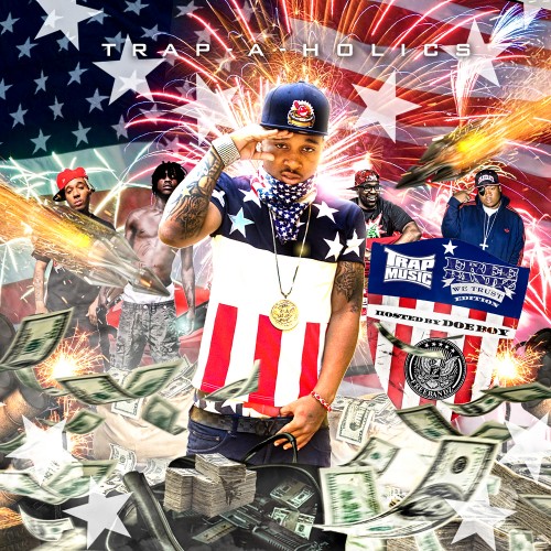
Scrolling through the Trap-A-Holics website I decided to write a blog about my personal feelings concerning EP, LP, and mixtape covers. For so long now I have noticed truly horrid examples of graphic work, clutter, flash, and tackiness.
Covers littered with currency (often floating around), half naked women "photoshopped"(pasted) into them, smoke everywhere, even the artist themselves "photoshopped" onto some "hood" background. Now I'm not insulting anyone, I myself am no Adobe Photoshop genius...honestly I'm probably terrible but I at least understand basic marketing and design.
This is of course my opinion and I am very much in love with minimalism but I think most can agree album artwork should be clean and not trashed with as much BS as possible.
Many Hip-Hop/Rap album artworks are great examples of good graphic design, i.e. the best selling Hip-Hop/Rap album of 2012 - Nicki Minaj "Pink Friday: Roman Reloaded". Elegant, clean, and minimal. But then your faced with this:
While there are no women you see guns, cash flying, fireworks, the U.S. flag, etc. etc.
Yes it catches your attention but I think there is just to much going on and I'm instantly turned off from even listening to it. The creator obviously shows talent in graphic work; I just think she/he should research good marketing and design. /endrant


No comments:
Post a Comment